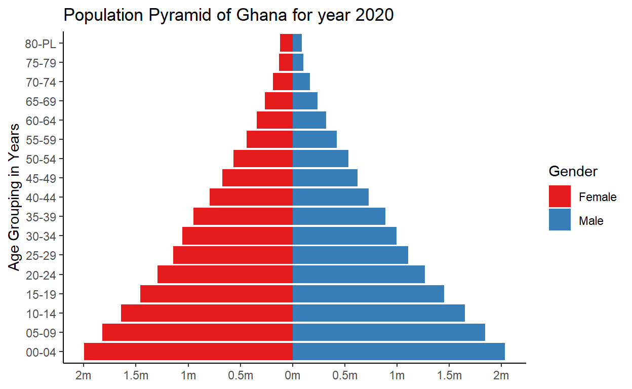
We begin by reading in a freely available data thatn contains the population structure of Ghana over the years. We are however only interested in that of the year 2020.
dataK <-
    readxl::read_xlsx(
        "ghana.xlsx",
        sheet = "2000 - 2020")
Next we manipulate and select the requisite data
df_for_pyramid <-
    dataK %>%
    select(ends_with("20")) %>%
    filter(BTOTL_2020==29340248) %>%
    pivot_longer(cols = BTOTL_2020:F80PL_2020) %>%
    filter(!name %in% c("BTOTL_2020", "MTOTL_2020", "FTOTL_2020") ) %>%
    filter(!str_detect(name, "^B")) %>%
    mutate(sex = str_extract(name, "^\\w"),
           agegrp = str_c(str_sub(name, 2, 3),"-", str_sub(name, 4,5)),
           Population = ifelse(sex == "F", -value, value))
Then we visualize a section of the data
# A tibble: 6 × 5
  name         value sex   agegrp Population
  <chr>        <dbl> <chr> <chr>       <dbl>
1 M0004_2020 2033091 M     00-04     2033091
2 M0509_2020 1841648 M     05-09     1841648
3 M1014_2020 1650193 M     10-14     1650193
4 M1519_2020 1449384 M     15-19     1449384
5 M2024_2020 1268097 M     20-24     1268097
6 M2529_2020 1104158 M     25-29     1104158
Finally we use the ggplot2 package to plot the population pyramid
df_for_pyramid %>%
    ggplot(aes(x = agegrp, y = Population, fill = sex)) +
    geom_bar(stat = "identity") +
    labs(title = "Population Pyramid of Ghana for year 2020",
         x = "Age Grouping in Years", y = NULL, fill = "Gender") +
    scale_y_continuous(
        breaks = seq(-2000000, 2000000, 500000),
        labels = paste0(as.character(c(seq(2.0, 0.5, -0.5),
        seq(0, 2.0, 0.5))), "m")) +
        coord_flip() +
    scale_fill_brewer(
        palette = "Set1", labels = c("Female","Male")) +
    theme_classic()